
Usually i get really exasperated by people who post a million photos of the same thing.
Like, here's my decorated tray. here's my decorated tray zoomed in. here's my decorated tray zoomed in but focused on one specific item with everything else blurry. here's my tray, on my ottoman, but still. the tray. here it is. but maybe with an overall room, instead of one item, it warrants a million photos. maybe.
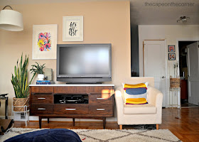
You may have noticed the blue wall is no longer. When we removed part of the wall for the kitchen reno, it obviously affected this wall, and since there was spackling and repairing on both this and the half moon table wall, we repainted. Did i want to repaint all 4 walls so there was no more tan living here, sure, sure. but my pro wouldn't do that. So this is second best.
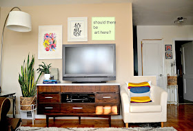
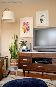
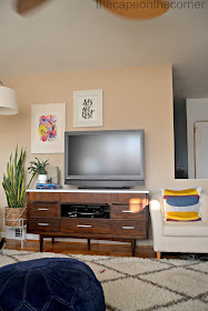
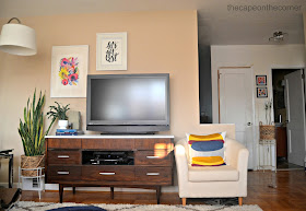
I'm not 100% sure about the artwork situation, if it needs one more piece or not. If you are just looking at the wall then i say yes, but when you take in the opening to the kitchen, i say no.
This is reading as boring. It's not in person. Grr.
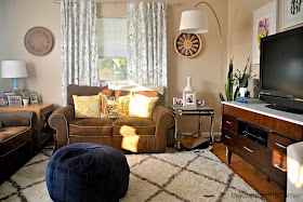
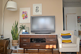
Corner moment!
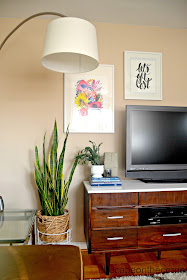
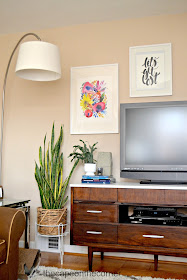
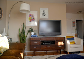
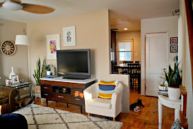
With or without? (I feel like i'm ordering cheesesteaks in the city.) I see the merits of both sides of this argument, but i like without. Without speaks to less clutter, doesn't stop your eye the way another art piece does, allows the corner to be a whole moment. Zooms right past wall into kitchen.

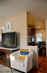
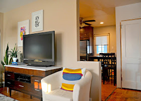
The wall is not that orangey. Grr again.
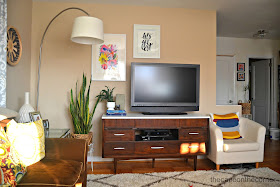

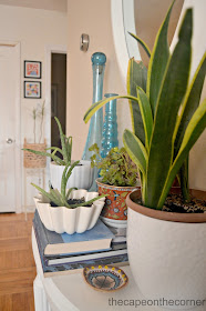
Gone are the baby blue accent wall days. Hello neutrals, i'm relieved to see you. Also, yeah green thumb!
Paint Color-Rawlings, Finneran Hailey matched to Benjamin Moore
Artwork-Minted via Domestically Speaking. Thanks MaryAnn!
Stripe pillow cover-Ikea
Blue ottoman-Amazon
Rug-RugsUSA
Arc Lamp-Home Depot
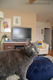
Gorgeous cats-Rescues.
You can find me all sorts of here: Molly, Coastal Charm, BNOTP, Keeping it Simple, DIY Showoff, Elizabeth & Co. , Stories A-Z, Sugar Bee Crafts, A Stroll Thru Life, Kim Six, Stone Gable, Domestically Speaking, Shanna, Blissful Bee, Savvy Southern Style, Handy Man, Houseologie, Charm of Home, No Minimalist Here, My Romantic Home, Somewhat Simple, Mustard Seed, Just us 4, Wetherills Say i Do, Shabby Nest, My Repurposed Life, Craftberry Bush, French Country Cottage, Chic on Shoestring, LollyJane, Overflowing, House by Hoff
Looks lovely! Love your TV console, too!
ReplyDeleteAs for the artwork, I think especially since the TV is not centered on the console, the artwork looks good "as is".
I really like the look of the whole room! I think the art work is fine as is and unless you find another piece you just must hang there, leave it blank.
ReplyDeletehugs,
Linda
One - I totally agree with you on the whole "tray" issue… here it is, here it is again on a piece of furniture, here it is with peonies, here it is with home decor books…
ReplyDeleteTwo - I think the art situation is fine as is until you find something that you absolutely love or must have.
Three - however, if you choose to go out and buy something, or shop around your house, what about something round or oval? A mirror? Just a thought as it might break up the how everything is square/rectangular on that wall, where as your other walls have rounded items. Just a thought.
What a lovely set up. I think a mirror would be fun there like a circular one. Love the retro and modern mix up here. Thank you for linking up to "Bloggers Who Have Inspired Me" it's good to have you back.
ReplyDeleteRachel xo
Http://garaytreasures.com
I'd put art on that spot! *casts vote*
ReplyDeleteThe room is lovely, keeps the eye interested. Good colors, not too formal but pretty stylish. :)
This is just the inspiration I needed for my sad little TV nook at home ... thank you so much for sharing :)
ReplyDeleteI love the way the art looks, keep it!!!
ReplyDeleteI've been thinking of painting my living room walls and the color
ReplyDeleteof yours is really what I'm looking for.. will have to hit the paint
chips at the HD... Thanks for your sweet comment, I've missed
blogging and am ready to get back into it..
Hope to chat soon! Thanks again!
Love it the way it is. Perfect.
ReplyDeleteI vote to add a piece of art and I love previous commenters idea of something round. It'd make it look like those gallery walls around a tv. :) Your living room looks great either way, though! I love the watercolor and those curtains!
ReplyDeleteWell, I'm ok with lots of photos of the same room/ thing because I always notice something
ReplyDeletesmall and new I haven't seen before lol:)
I love your room! The tv cabinet is gorgeous! Love the decor. I would hang something there,
but maybe it's my OCD talking ;)
I hope you will share your post with our link up:
http://milaslittlethings.com/2015/07/idea-box-thursday-link-party-18.html
xx
Mila
Because the TV isn't centered on the stand, there needs to be something to square the whole area of. I agree that it can be round, oval etc, but it looks unbalanced to me.
ReplyDeleteI think the whole room is beautiful, but I agree with you about wavering on the artwork. That is a sign of a creative mind: indecision! Thanks for linking up to You're Gonna Love it
ReplyDeleteYour living room is coming along beautifully! And yes, I think you need one more art there up on the tv. Saw this at Martys by the way!
ReplyDeleteI think it looks just lovely - warm and inviting. I would vote for another piece, just to balance the chair on the right. But, if you chose to leave just the one, it surely looks pretty, as is!
ReplyDeleteHow have I not seen this before? I love that gallery wall. Perfection!
ReplyDeleteHave a wonderful, sunny weekend!
Thank you for visiting my blog! I vote for something in that spot. The room looks great!
ReplyDeletexo Dianne
I LOVE the textured pieces on the wall, overall the space is looking beautiful. I had a hard time balancing artwork with my tv too (for eh, 5 years, ha!) and finally found that a big grouping extending from one wall to the other above the TV balances it.
ReplyDeleteI think it looks just lovely. Have a wonderful weekend! I hope you will share your post with our link up: https://www.aurakitchens.com
ReplyDelete