Alright already. Let's look at some kitchen progress and some kitchen plans.
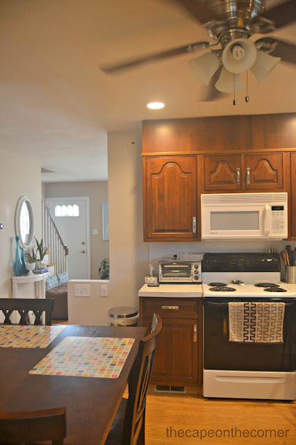
The sight lines were improved when this wall was partially removed, allowing for more light and more connection between all the spaces.
Hallelujah, can lights. Pot lights. Recessed lights. Whatever you wanna call them, we desperately needed them. It was so dark in here with the green walls and these cabinets, so we repainted the walls Sherwin Williams' Modern Gray. It's a very very subtle gray. Also, scrolly piece above sink is gone!
It's the small things.
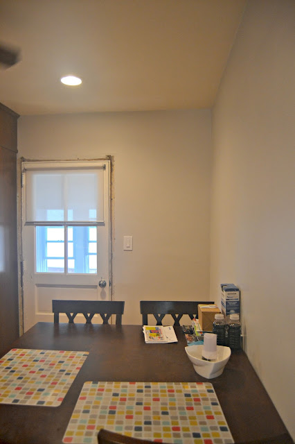
Added a light switch at the back door and removed it from right above the table.
Love seeing the front door from here, when before it was completely closed off.
We got a quote from the cabinet maker for a trashcan cabinet, to be added where the current trashcan is. This would extend the countertop and be great prep space, as we are also losing the toaster oven.
Guess how much one cabinet would be.
You'll never guess.
$2500 bucks. Say whaaaattt?!!
To hold a trash can??? No. N.O.
Apparently, these are really good cabinets (which we knew, it's why we aren't replacing them) but we didn't know they were that fancypants.
To get our cabinets in today's market would cost, according to the cabinet company (who referred to the cabinets as "furniture") a whopping $40,000.
USB outlets, my one request, and the relocated light switches. This wall will be topped with the same counter tops as the rest of the space.
You can see the unevenness in the floor here between the kitchen and the vestibule.
BTW, is a vestibule still a vestibule if it's not a separate space anymore???
You can also, apparently, see Giraffe, Lily's favorite toy.
I can't deal with this blog spacing, I hope it isn't deterring you from reading. It's deterring me from blogging, I can tell you that. Don't know how to fix it.
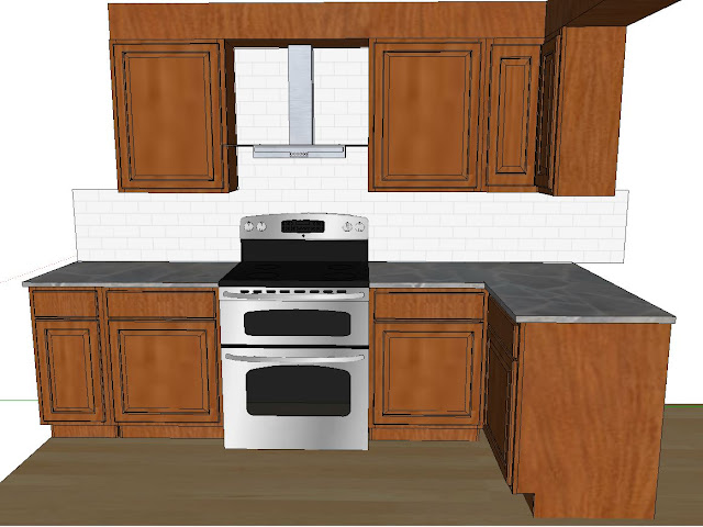
Realistic renditions of outcome. I told the boyfriend before we ordered appliances (namely, the range hood) that i needed to see it in the space. He whipped these bad boys up, but i told him this wasn't realistic. But oh, how I wish it was. I wish we had square cabinet doors on top and bottom, not arches on the top. So he swapped out the squares so i could get the correct feel...and it'll do Donkey, it'll do.
It was either the range hood above or this one. I feel like this one, with the arches, reads as country or traditional, and i'm not going to let those arches tell me what to do.
I will not pander to the arches!
We also liked the idea that you'd see more backsplash with the hood above. Notice the extended space to the left of the stove, where the trashcan cabinet would be (that he will likely make, as we are not spending $2500). Ain't nobody got time for that.
The flooring and the appliances are all ready to go. Can't wait for more!
What's your favorite thing about your kitchen?
You can find me all sorts of here: Molly, Coastal Charm, BNOTP, Keeping it Simple, DIY Showoff, Elizabeth & Co. , Stories A-Z, Sugar Bee Crafts, A Stroll Thru Life, Kim Six, Stone Gable, Domestically Speaking, Shanna, Blissful Bee, Savvy Southern Style, Handy Man, Houseologie, Charm of Home, No Minimalist Here,My Romantic Home, Somewhat Simple, Mustard Seed, Just us 4, Wetherills Say i Do, Shabby Nest, My Repurposed Life, Craftberry Bush, French Country Cottage, Chic on Shoestring, LollyJane, Overflowing, House by Hoff, shaken together, Garay Treasures Thrifty Decor Chick


